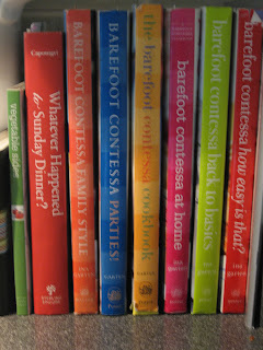
Here are the pictures from our first assignment- the composition guidelines.
 |
| Bird's Eye View |
 |
| Worms Eye View |
 |
| Verticle |
 |
| Unbalanced |
 |
| Tilt |
 |
| Strong Center of Interest |
 |
| Simple |
 |
| Rule of Thirds |
 |
| Leading Lines |
 |
| Horizontal |
 |
| Framing |
 |
| Eye level |
 |
| Diagonal |
 |
| Curved |
 |
| Cluttered Background |
 |
| Close Up |
 |
| Balanced |
 |
| Merger |
 |
| Avoiding Mergers |

No comments:
Post a Comment